This Manufacturing Output Histogram Analysis Excel Template is a powerful tool designed to help manufacturers, production managers, and quality control teams visualize and analyze the distribution of manufacturing output. Whether you’re monitoring production efficiency, identifying trends, or assessing variability in output, this template provides a structured framework for creating insightful histograms.
Key Features:
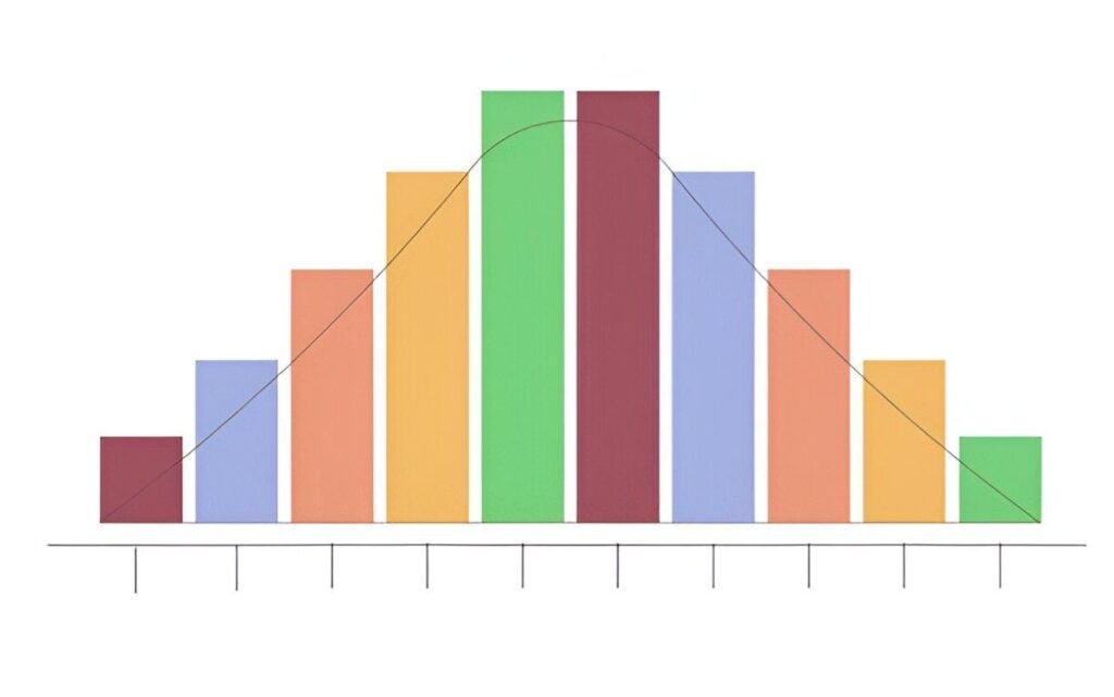
- Histogram Creation : Automatically generates a histogram based on your input data, allowing you to visualize the frequency distribution of manufacturing output.
- Customizable Bins : Define custom bin ranges to categorize your output data according to specific intervals (e.g., units produced per hour, day, or week).
- Data Input Section : Includes a dedicated section for entering raw manufacturing output data, making it easy to update and analyze new datasets.
- Dynamic Chart Updates : The histogram chart dynamically updates as new data is entered, ensuring real-time visualization of output trends.
- Summary Statistics : Provides key metrics such as mean, median, mode, standard deviation, and total output to support data-driven decision-making.
- Professional Design : Clean layout ensures ease of use and professional presentation, suitable for internal analysis or client reports.
Use Cases:
- Production Managers : Analyze the distribution of daily or weekly output to identify inefficiencies or bottlenecks in the production process.
- Quality Control Teams : Use the histogram to assess variability in output and ensure consistency in product quality.
- Manufacturing Analysts : Track trends over time and compare output across different periods or production lines.
- Business Owners : Simplify the process of monitoring manufacturing performance without investing in complex analytics software.
How It Works:
This Manufacturing Output Histogram Analysis Excel Template is designed to be intuitive and user-friendly. Here’s how it works:
- Input Raw Data : Enter your manufacturing output data (e.g., units produced per hour or day) into the designated “Data Input” section.
- Define Bin Ranges : Customize the bin ranges in the “Bins” section to categorize your data into meaningful intervals (e.g., 0–100 units, 101–200 units).
- Generate Histogram : The template automatically calculates the frequency distribution and generates a histogram chart based on your data and bin ranges.
- Review Summary Metrics : Check the summary statistics (mean, median, mode, standard deviation, etc.) to gain insights into your manufacturing output.
- Analyze Trends : Use the dynamic chart and summary metrics to identify patterns, variability, or areas for improvement in your production process.