This Ranking Chart Excel Template is a simple yet effective tool designed to help you visualize and rank data points based on specific criteria. Whether you’re analyzing performance metrics, prioritizing tasks, or comparing categories, this template provides a clear framework for decision-making. With its user-friendly layout and customizable features, it’s perfect for project managers, analysts, and teams looking to prioritize or evaluate scenarios.
Key Features:
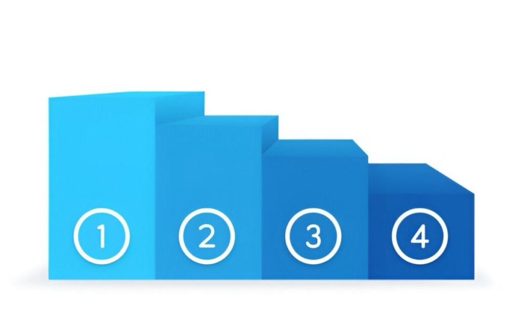
- Dynamic Ranking Chart : Includes a pre-formatted bar chart that ranks data points in descending or ascending order, depending on your needs.
- Customizable Axes : Adjust the X-axis (e.g., Scores, Values) and Y-axis (e.g., Categories, Items) labels to fit the specific needs of your analysis.
- Data Input Table : A dedicated table allows you to input data points, assign categories, and specify their values for ranking.
- Clear Visualization : Highlights ranked data points, making it easy to identify top performers or areas needing attention.
- Scalable Design : Easily add or remove rows to accommodate changes in scope or additional data points as your analysis evolves.
Use Cases:
- Project Managers : Rank tasks or team members based on performance metrics like productivity or quality.
- Analysts : Evaluate and compare categories such as sales figures, customer feedback scores, or operational efficiency.
- Team Leaders : Prioritize initiatives by ranking them based on impact, effort, or value.
- Business Strategists : Analyze opportunities or challenges by ranking them on dimensions like cost, benefit, or risk.
- Educators and Students : Teach or learn about data visualization techniques and ranking frameworks.
How It Works:
- Input Data Points : Begin by listing all data points in the table. Include categories and their corresponding values (e.g., Scores, Ratings).
- Plot on the Chart : The template will automatically rank the data points and display them on the bar chart based on their values.
- Analyze Rankings : Review the placement of data points to identify patterns or priorities. For example, items at the top of the chart may represent high-priority tasks or top performers.
- Customize Axes : Modify the axis labels and ranges to reflect the dimensions relevant to your analysis (e.g., Cost vs. Benefit, Effort vs. Value).
- Add Labels : Use the chart to display data point labels for better clarity and identification.
- Customize and Share : Modify colors, labels, or categories to better fit your project or organizational needs. Save the file digitally for ongoing updates or print it for presentations.
With its focus on precision and clarity, this Ranking Chart Excel Template simplifies the complexities of data visualization and prioritization. Download now to streamline your decision-making processes and achieve your goals efficiently!