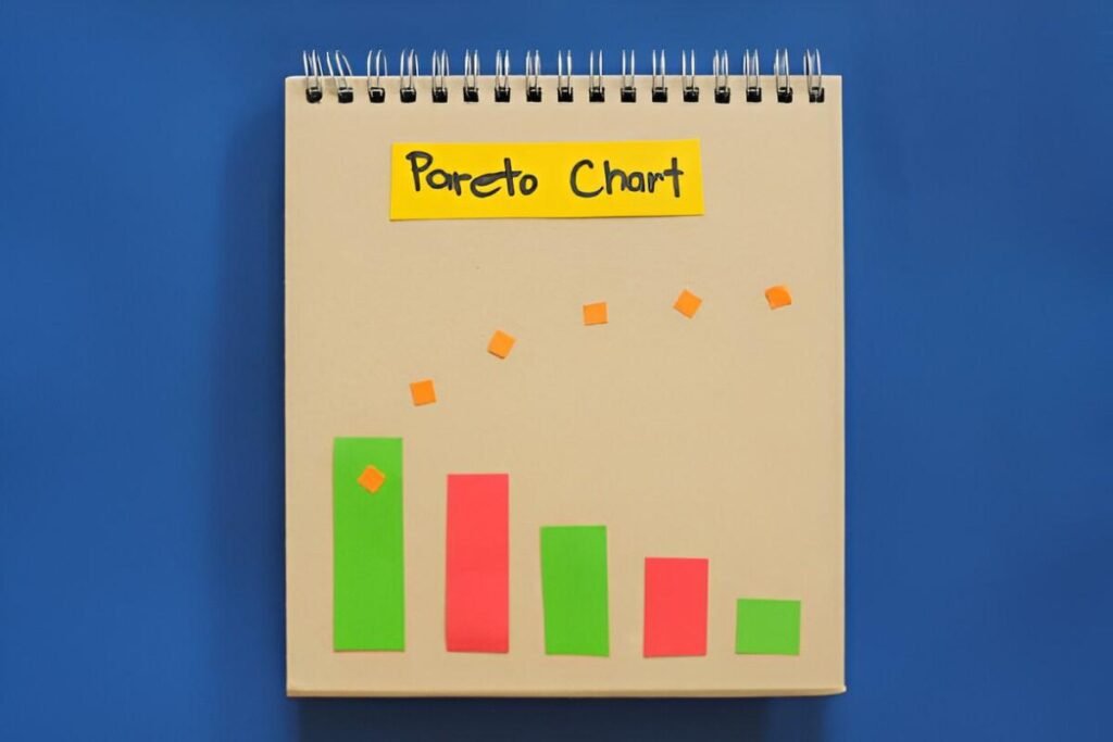
This Dynamic Pareto Chart Excel Template is a professional and customizable tool designed to help businesses and individuals analyze and visualize data using the Pareto principle (80/20 rule). Whether you’re managing quality control, customer complaints, inventory issues, or any other dataset, this template provides a clear and interactive way to identify the most significant factors contributing to a problem.
Key Features
- Dynamic Data Sorting : Automatically sorts data in descending order based on frequency or impact, ensuring the most critical factors are highlighted first.
- Cumulative Percentage Line : Displays a line graph showing the cumulative percentage contribution of each factor, making it easy to apply the 80/20 rule.
- Customizable Input Fields : Easily input your own data categories and values to tailor the chart to your specific needs.
- Interactive Design : Adjust the number of categories displayed or modify data points to see real-time updates in the chart.
- Professional Layout : Clean and organized design ensures ease of use and readability for presentations or reports.
Use Cases
- Quality Control : Ideal for identifying the most common defects or issues in manufacturing processes.
- Customer Service : Helps businesses analyze the primary causes of customer complaints or returns.
- Inventory Management : Assists in pinpointing the items or suppliers contributing to the majority of inventory costs or delays.
- Project Management : Supports prioritization of tasks or risks based on their impact or frequency.
- Business Analysis : Provides insights into sales, expenses, or operational inefficiencies to guide strategic decisions.
How It Works
- Input Your Data : Replace placeholders with your own categories (e.g., defect types, complaint reasons) and corresponding values (e.g., frequency, cost).
- Review the Chart : The template automatically generates a Pareto chart with sorted bars and a cumulative percentage line.
- Apply the 80/20 Rule : Identify the top 20% of factors responsible for 80% of the outcomes or issues.
- Customize as Needed : Adjust colors, labels, or chart settings to align with your preferences or branding.
- Save and Share : Once completed, save the file and share it with your team, management, or stakeholders for review.